Comic Book-Inspired Illustrative Medical Visualization

Medical visualization isn’t always about rendering data in the most realistic way possible. In fact, quite often it isn’t. Illustrative rendering techniques have been developed that present medical data to the viewer in a style that is more abstract, often emphasizing important features, while taking emphasis away from the less relevant. Illustrative rendering techniques can even make data originating from medical imaging scanners such as CT, look hand-drawn. Check out for instance the works by Tobias Isenberg, Stefan Bruckner, Ivan Viola and Kai Lawonn to name a few. As you may recall, last year’s VCBM paper I had the pleasure of co-authoring also involved illustrative rendering:
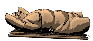
Illustrative rendering of a CT scan

So what you see here kind of looks like a sketch hinting at the shape of the human body on a table right (well with some limbs missing ;))? Actually it’s a rendering of a CT scan combining toon shading and feature lines without any artists involved. Here’s another example by Roy van Pelt:
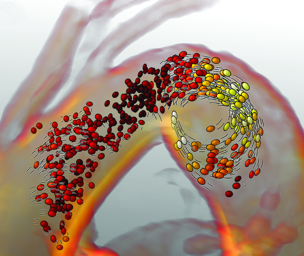
Roy van Pelt's blood flow visualization
Roy van Pelt’s blood flow visualization

He visualized blood flow using particles that get elongated as they move faster in combination with speed lines indicating the direction and speed of the particles. This style is reminiscent of something you could see in comic books or cartoons. In fact, I think there is a lot we can learn from comic book artists that we can apply to medical visualization.

For this reason, I asked Gerrit Rijken, AKA Iosua, a freelance illustrator as well as comic book aficionado, to write about the basics of inking, and more specifically the do’s and don’t’s and why’s of it all. In his elaborate post, which you can find here, he talks us through many things that are of interest in illustrative rendering as well. He describes how inking techniques are applied to create textures, the importance of line weights, spotting blacks, screen tones, feathering and cross-hatching. He provides explanations of these techniques combined with examples illustrating the concepts.

I see many parallels to visualizing techniques. For instance, focus-and-context techniques and depth cues are relevant for both comic books and medical visualizations. There are also some interesting rules on line thickness that I had not considered before. Furthermore I see techniques that have already been adopted in medical illustrative rendering, such as stippling and hatching, while I did not see researchers using feathering yet (correct me if I’m wrong ^^). I hope you find this as interesting as I did and if you have further questions, do not hesitate to contact him!
Colormaps in Medical Visualization

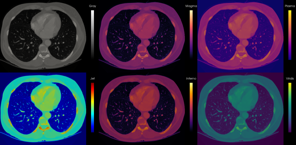
So I guess we all know rainbows are bad, mmmkay. That’s why I wrote a lengthy blogpost for medvis.org and more recently a follow-up featuring four new pretty colormaps designed for Matplotlib. I realized though that I did not see the prettiness applied to medical datasets so I went to town with Paraview 5.0 (which includes the new colormaps by default now). I took these colormaps for a spin on a slice of the CALIX dataset from the OsiriX dataset collection, an arterial phase CT scan of the abdomen (and part of the thorax as you see below). I wanted to put the four new colormaps (Magma, Inferno, Plasma, and Viridis) side-by-side with the traditional grayscale and Jet (AKA rainbow) colormap to show what they look like on a medical dataset:

Medical Visualization Colormaps
Medical visualization colormaps: CT thorax

Looks kind of artistic, am I right? I would totally buy a print and frame it! So the gray scale is doing fine of course, and what we are accustomed to in medical images. The banding in the Jet colormap focuses the attention on the vertebra and ribs, which is probably not what you are actually interested in. Also information is lost in the soft tissue areas (muscle and fat). The four proposed colormaps are doing fine, though Plasma and Viridis start from blue tones, which is probably not what you expect when viewing on a black background, but can work well in case the low intensity regions contain information you actually want to show on a black background. I would love to compare with Matlab’s Pareto, but hey, proprietary, what’s a girl to do ^^

Now, of course, there is not much reason to replace the gray map when viewing single modality medical imaging data, but it could be interesting to consider for multimodal fusion viewing. For instance, when PET and CT are combined (either from a hybrid scanner or by software registration), often the anatomical CT data is represented in a gray colormap, while the functional metabolic information from the PET is shown overlaid in a color colormap (lol). This works well because both colormaps can be perceived simultaneously very well. For this, often a heated-body colormap is used, but you could also consider these four new options, as this is not a standardized choice and varies per manufacturer.

So far I’m talking about 2D representations, such as the traditional slice views above. When rendering 3D scenes though, and for instance wanting to map a scalar value on a surface to a color, one should be careful with these new maps. Since they are not iso-luminant, the changes in luminance may interfere with surface shading from lighting. Let’s take a look at a silly example:

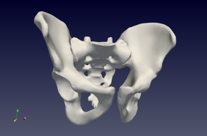
os coxae magma colormap 3d
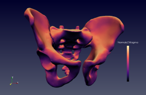
Os Coxae surface normals in Z direction mapped to colormap Magma

This is a bit of a stupid example, because I don’t have proper data I can show you (I am only working with the most top-secret rectum information). But what we see here is a surface model of the os coxae with the normal Z component mapped to the Magma colormap. So what’s shading and what’s normal information in this case? Who’s to say? I am obviously:

Os coxae standard shading

So this is why you need iso-luminant colormaps for 3D surface information mapping, kids! Also, consider the Plasma, Inferno, Magma and Viridis for your 2D visualizations because:

  • They are beautiful
  • They are colorblind safe
  • They are printer-friendly (this means printers become happy when you print them (j/k, it means when you print grayscale it still works))
  • They are perceptually linear

EuroGraphics Education paper ‘The Online Anatomical Human: Web-based Anatomy Education’ accepted!

So last, well, let’s go with week, I hinted at a notification for a submitted EuroGraphics Education paper. I got said notification last week already, but was too busy with the EuroVis (EuroEverything!) Short Paper deadline to post about it.

As there is some sort of spoiler already in the title, it is probably not so surprising anymore, but there is an unexpected twist ;)… Our EuroGraphics 2016 Education paper on ‘The Online Anatomical Human: Web-based Anatomy Education’ was accepted, as a, drumroll please, short paper! Since I’m in my shortening-8-page-papers-to-half-their-size-mode (see also above: EuroVis Short Paper) anyway, good timing I guess 🙂

I updated the demo video with the latest version of the OAH, which now features textures and will soon be deployed in an upcoming Coursera MOOC on Anatomy of the Abdomen and Pelvis:

That’s all from the reigning Queen of Short Papers for now. My next double notification date is on March 18th, for the EuroVis STAR and Short Paper.

On Research Visits, Paper Writing and Club Mate

First up: a little In Memoriam for The ‘Weekly Status Update’. Remember those? I vaguely recall wanting to post weekly updates with five bullet points each. Ain’t nobody got time for that! I’m following up on excellent advice by cpbotha:  “when under-achieving, lower your standards”. I’m no longer setting any expectations here, I just post whenever I want, whatever I want from now on. So what’s cooking?

  • Last week I briefly visited the University of Koblenz · Landau, in, you guessed it, Koblenz to work on a EuroVis STAR paper (time to shine) with the newly minted J.- PROF. DR. KAI LAWONN, who you may remember from:
  • I’m currently visiting Bernhard Preim‘s excellent visualization group in Magdeburg to:
    • Meet the lovely group members
    • Work on the aforementioned paper (deadline: 14th of February, I can’t even…)
    • Oh and I also gave a talk last week. It was all over the news ;), but in case you missed it, check the group website
  • We are writing the aforementioned paper in Overleaf. Which is pretty awesome. I might do a little comparison post on ShareLatex vs. Overleaf when deadline season is over (estimated timeframe: never).
  • I’m getting a notification for a EuroGraphics Education paper I submitted next week on Monday. Will this end my paper rejection streak? Time will tell 🙂
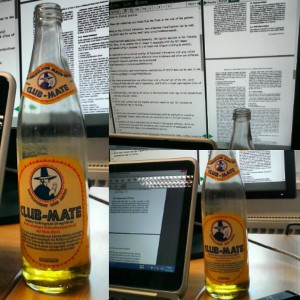
  • I should probably get back to, oh writing a paper or two, but I’ll leave you with a nice action photo:
Club Mate
Drinking Club Mate and writing a paper. Kind of a big deal!

I didn’t realize when I bought it, but apparently, Club Mate is/was totally the hacker tech-startup drink of choice and I am now officially totally cool for drinking that.

Did I just write out five bullet points? Is this a Weekly Status Update in disguise?

2016 is here! A time for looking back and looking forward.

If cpbotha can post after a four month hiatus, then so can I ^^.  First of all, all the best for 2016 to all of you! I hope it’s a good one.  The start of a new year is as good a time as any (if not better) for a look back, or review if you want to get fancy about it, of the previous year and to look forward to things happening in the time ahead.

First up, looking back:

  • I didn’t blog so much, because a) I was crazy busy (final year of the PhD anyone?), and b) personal issues that I will not discuss here. Maybe I will increase the update frequency, maybe I won’t. Wait and find out?
  • In September, I presented at VCBM! My favorite conference in the world (eat it, VIS!). It was in Chester, UK this year (full report here) and I presented work festively entitled “Illustrative Multi-volume Rendering for PET/CT Scans”, which does exactly whatever you think it does. To make sure it does, check the full paper and pretty pictures here.
  • In September/October I went on a month-long research visit to the Bergen Visualization group in Norway, which was great for several reasons:
    • I met soooo many cool new people as well as cool people I knew from conferences before. It’s really an excellent group in all ways possible.
    • Bergen itself is really heaven on earth. It has it all, mountains within walking distance, a harbor, waffles and lots of metal. Also, VCBM 2016!
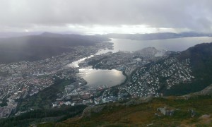
    • A little more on these mountains…. I’m not much of a sporty person, but on my first weekend there, I was invited to hike up Ulriken (only the highest of the Seven Mountains they have, luckily):
      Ulriken Bergen
      Ulriken as viewed from the airport bus

      Talk about life-changing experiences… Mind=blown by the view, experience and sheer exhaustion.

      View from Ulriken, Bergen
      View from Ulriken, Bergen. Hi, Bergen!

      It’s quite addictive really. I hiked up there once more during my stay. I could definitely see that becoming sort of just a thing to do on the weekends while living there.

    • I presented at a medviz seminar, check the flyer here. Yes, there was a flyer with my face on it!
    • I got some great PhD advice and started collaborating on a paper together. I can really recommend a visit like this, if it is at all possible, to anyone doing a PhD.
  • 2015 was definitely the year of collaborations. Good ones too (for me at least ^^)! I worked with people from Leiden, Magdeburg, Bergen and recently Koblenz, and they are all awesome and I hope to do more of that in 2016.

Then for the looking forward bit:

  • I hope to have more awesome collaborations in 2016.
  • I have approximately a million, ok four-ish, papers to wrap up and then…
  • I don’t want to alarm you or anything, but 2016 could be the year I get my PhD (correction sent in by cpbotha: get doctorified) . After which I’ll have to change the subtitle of this blog into something yet unknown. I’m not the world’s biggest fan of change, but let’s just say, ‘it is time’. I’ve been walking around at the TU Delft since 2005 (yes, really…), first as a bachelor student, then master, then PhD, and a decade is more than enough for me. I’m looking forward to starting something new somewhere else. Anywhere else 😉

Alright, I just spent my full two week holiday working interspersed with family visits, the first part of which is not really my style, but hey, desperate times, desperate measures. So I guess I’d better go finish 1 out of those million papers. Till next time!

VCBM paper ‘Illustrative Multi-volume Rendering for PET/CT Scans’ accepted!

Our full paper on Illustrative Multi-volume Rendering for PET/CT Scans[1] was accepted for presentation at the always awesome VCBM workshop. I will be presenting it in Chester (UK) in September. For now, a teaser image of our technique:

lasmprvi_vcbm2015
Illustrative Multi-volume Rendering for PET/CT Scans teaser image

Even cheaper standing desk at IKEA

As I previously mentioned, IKEA used to sell reasonably priced automatically adjustable standing desks in the IKEA Bekant series. They recently introduced a new series though, that is even more affordable. For 200 euro, you can now get a Skarsta adjustable sitting / standing desk. You can also upgrade to a slightly larger version for 30 euros more. I think this is the smaller version shown here:

Ikea's latest standing desk: the Skarsta
Ikea’s latest standing desk: the Skarsta

What’s the catch, you may be wondering? Well the catch is that the Skarsta requires manual, eh, cranking? to adjust the position:

SKARSTA Bureau zit/sta IKEA
You crank that desk, boy!

We have tested the desk for about two weeks now here at home, and it’s working like a charm! Bonus points for the arm workout involved ^^.

Update: For those wanting more tech details on this table (which seems to be a lot of you, judging by the comments section 😉 Cam Dore just shared this useful link to the manual in the comments. Thanks!