So I guess we all know rainbows are bad, mmmkay. That’s why I wrote a lengthy blogpost for medvis.org and more recently a follow-up featuring four new pretty colormaps designed for Matplotlib. I realized though that I did not see the prettiness applied to medical datasets so I went to town with Paraview 5.0 (which includes the new colormaps by default now). I took these colormaps for a spin on a slice of the CALIX dataset from the OsiriX dataset collection, an arterial phase CT scan of the abdomen (and part of the thorax as you see below). I wanted to put the four new colormaps (Magma, Inferno, Plasma, and Viridis) side-by-side with the traditional grayscale and Jet (AKA rainbow) colormap to show what they look like on a medical dataset:
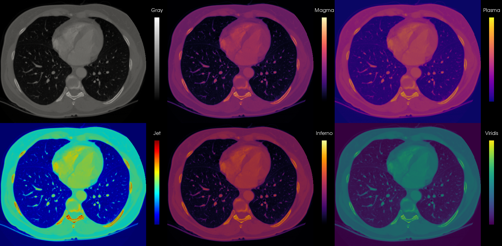
Looks kind of artistic, am I right? I would totally buy a print and frame it! So the gray scale is doing fine of course, and what we are accustomed to in medical images. The banding in the Jet colormap focuses the attention on the vertebra and ribs, which is probably not what you are actually interested in. Also information is lost in the soft tissue areas (muscle and fat). The four proposed colormaps are doing fine, though Plasma and Viridis start from blue tones, which is probably not what you expect when viewing on a black background, but can work well in case the low intensity regions contain information you actually want to show on a black background. I would love to compare with Matlab’s Pareto, but hey, proprietary, what’s a girl to do ^^
Now, of course, there is not much reason to replace the gray map when viewing single modality medical imaging data, but it could be interesting to consider for multimodal fusion viewing. For instance, when PET and CT are combined (either from a hybrid scanner or by software registration), often the anatomical CT data is represented in a gray colormap, while the functional metabolic information from the PET is shown overlaid in a color colormap (lol). This works well because both colormaps can be perceived simultaneously very well. For this, often a heated-body colormap is used, but you could also consider these four new options, as this is not a standardized choice and varies per manufacturer.
So far I’m talking about 2D representations, such as the traditional slice views above. When rendering 3D scenes though, and for instance wanting to map a scalar value on a surface to a color, one should be careful with these new maps. Since they are not iso-luminant, the changes in luminance may interfere with surface shading from lighting. Let’s take a look at a silly example:
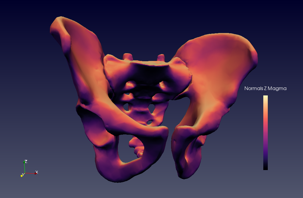
This is a bit of a stupid example, because I don’t have proper data I can show you (I am only working with the most top-secret rectum information). But what we see here is a surface model of the os coxae with the normal Z component mapped to the Magma colormap. So what’s shading and what’s normal information in this case? Who’s to say? I am obviously:
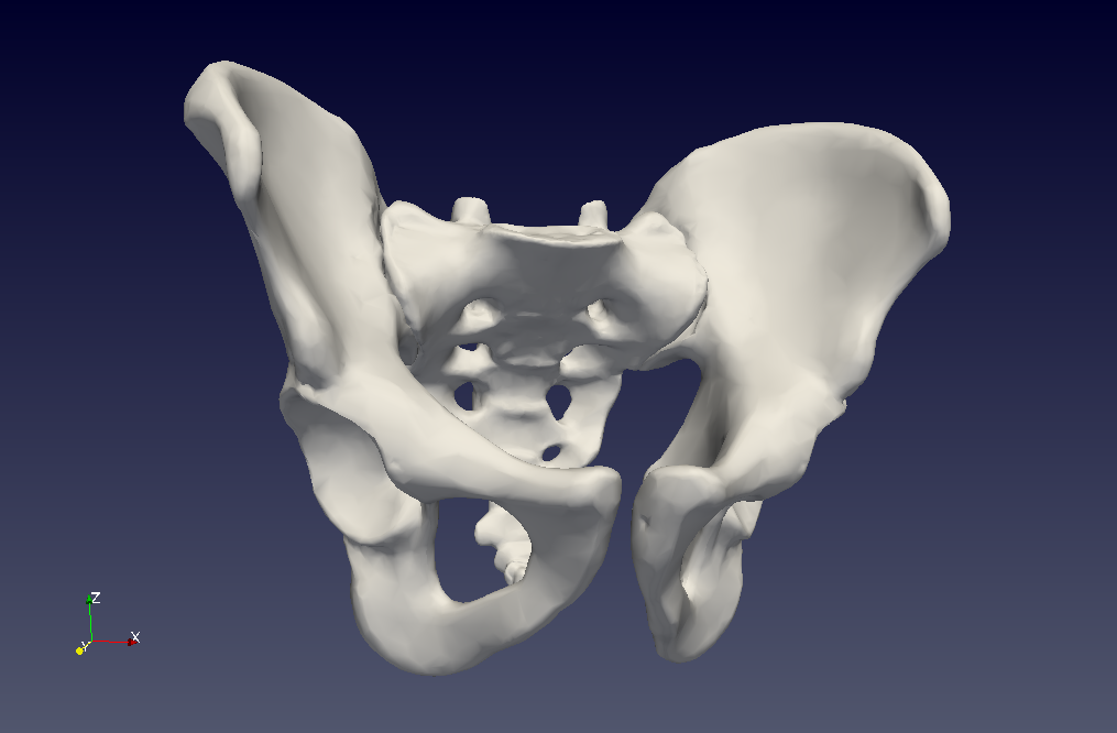
So this is why you need iso-luminant colormaps for 3D surface information mapping, kids! Also, consider the Plasma, Inferno, Magma and Viridis for your 2D visualizations because:
- They are beautiful
- They are colorblind safe
- They are printer-friendly (this means printers become happy when you print them (j/k, it means when you print grayscale it still works))
- They are perceptually linear